First steps
Personal home page
After login, the user is redirected to a start page for orientation. This start page differs depending on the authorization and classification of the user:
- For read-only users, the search page is displayed after login.
- For users with write permissions, the dashboard is displayed after login. On this dashboard an overview of the current changes and objects is visible.
- System administrators are directed to the tenant page for managing users and models.
Application layout
The application window has the following sections:
Sidebar
The sidebar provides access to all models and to data governance.
The sidebar can be expanded and collapsed. When collapsed, the labels are hidden and only the icons are displayed.
Models
The sidebar provides access to all models. Models marked as favorite can be selected directly. All other models can be selected in the dropdown "More".
The sorting of the models in the sidebar is determined by the model order.
Multiple models can be created for each model type.
Data Governance
The sidebar provides access to data governance:
| Description | |
|---|---|
Data Excellence | Management of persons, groups, posts, and roles in the DX organization. |
Search | Search and management of assets. |
Issues | Search and management of issues. |
Approvals | Search and management of approvals. |
Discussions | Search and management of discussions. |
Dashboard | Management of the personal assets, issues, approvals, and jobs in the dashboard. |
Tenant | Management of models, users, workflows, and profiles in the tenant. |
Metadata Query | Query metadata with customer-specific SQL statements. |
Depending on the selected access level, some entries may be hidden.
Menu bar
The menu bar contains the breadcrumbs, the search field as well as additional settings.
Breadcrumbs
Breadcrumbs show the complete hierarchical path to the currently open page or displayed element.
Breadcrumbs allow a direct and easy navigation to higher-level pages and elements.
Search
To search for metadata (full-text search), a search term can be entered in the search field in the menu bar.

By clicking on the icon  , the search page can be opened directly, without entering a search term.
The search results are displayed directly in the preview.
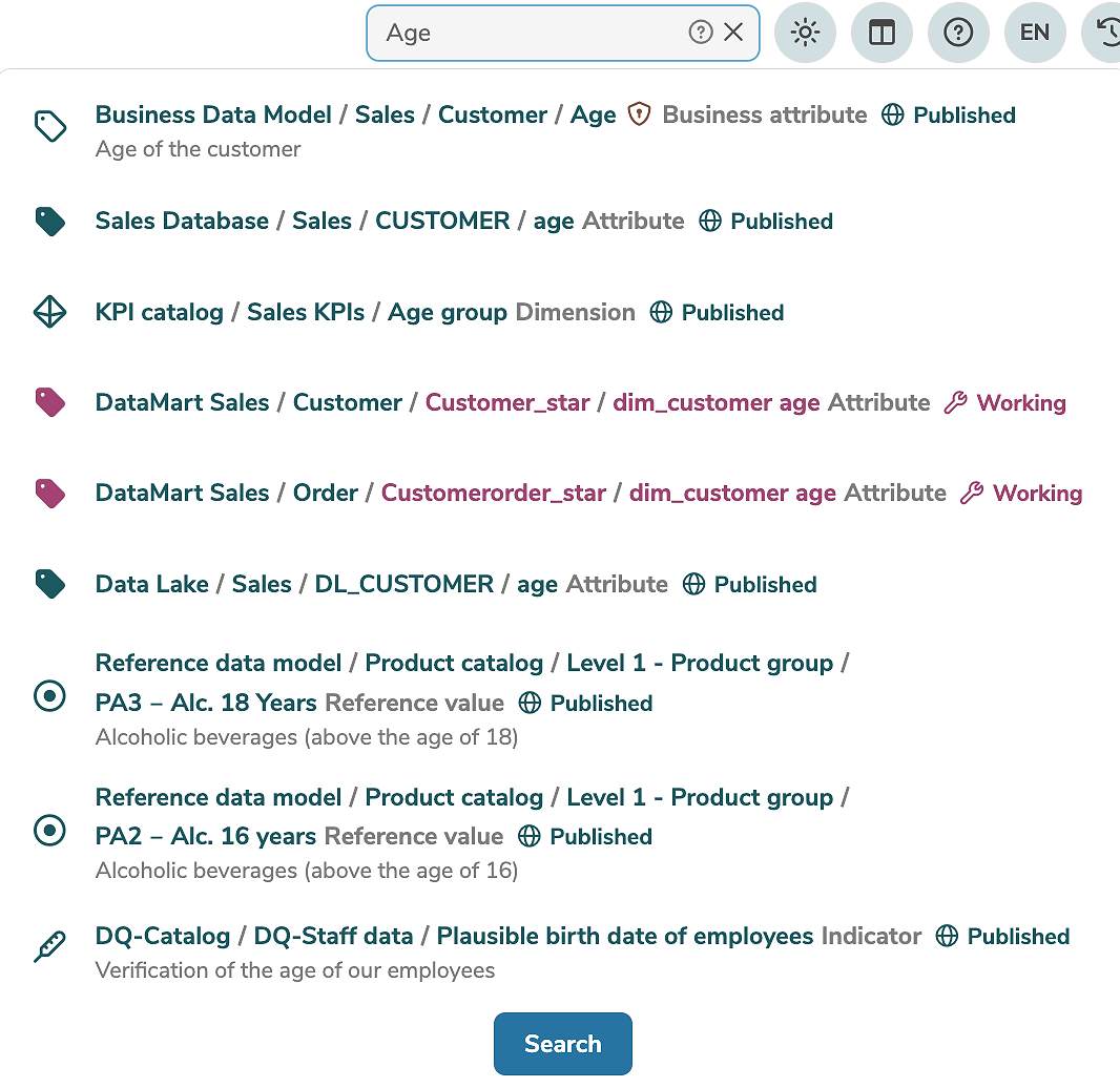
By default, the search matches only whole words.
For example, a search for Person will display elements that contain exactly Person, but not elements that contain words that merely begin with Person (e.g. Personnel or Persons).
To search for elements that begin with a specific term, an asterisk (*) must be added to the search term.
For example, a search for Person* will display elements that contain exactly Person, as well as elements that contain words beginning with Person (e.g. Personnel or Persons).
Clicking on the icon ? in the search field displays additional search tips.
By clicking on the preview a found element can be opened. By clicking on "Search" the search results are displayed on the search page, where further search criteria and filters can be selected.
Settings
The menu bar contains additional settings:
- The icon
 changes the theme (color scheme).
 - The icon
 sets the page layout to a split or wide layout.
 - The icon
 opens the manual.
 - The icon
 changes the language (English or German).
 - The icon
 starts the time travel.
 - The icon
 displays the notifications.
 - The icon
 opens the personal user menu.
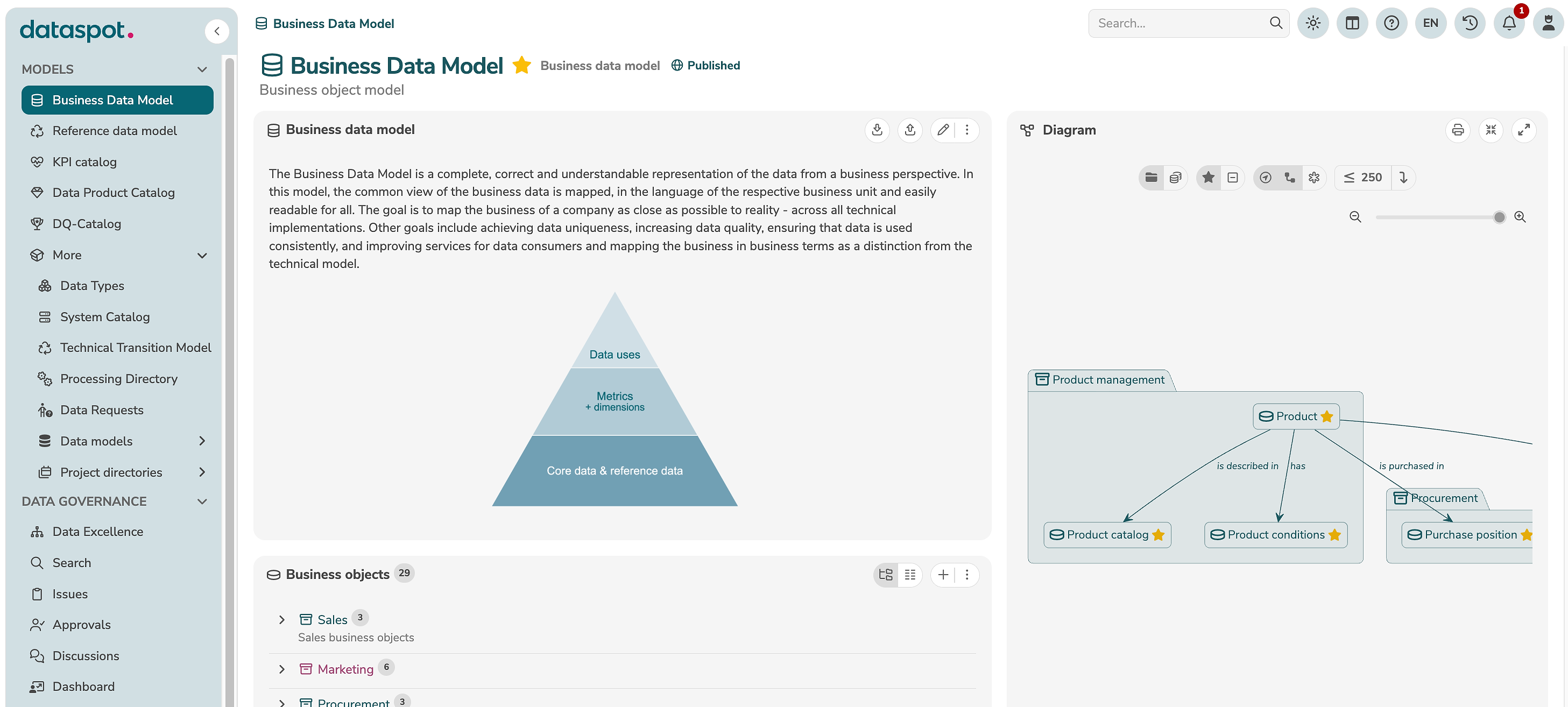
Main window
The main window displays the currently open page. Depending on the selected element, the main window can contain a main panel, a subpanel, a diagram, and additional tabs.
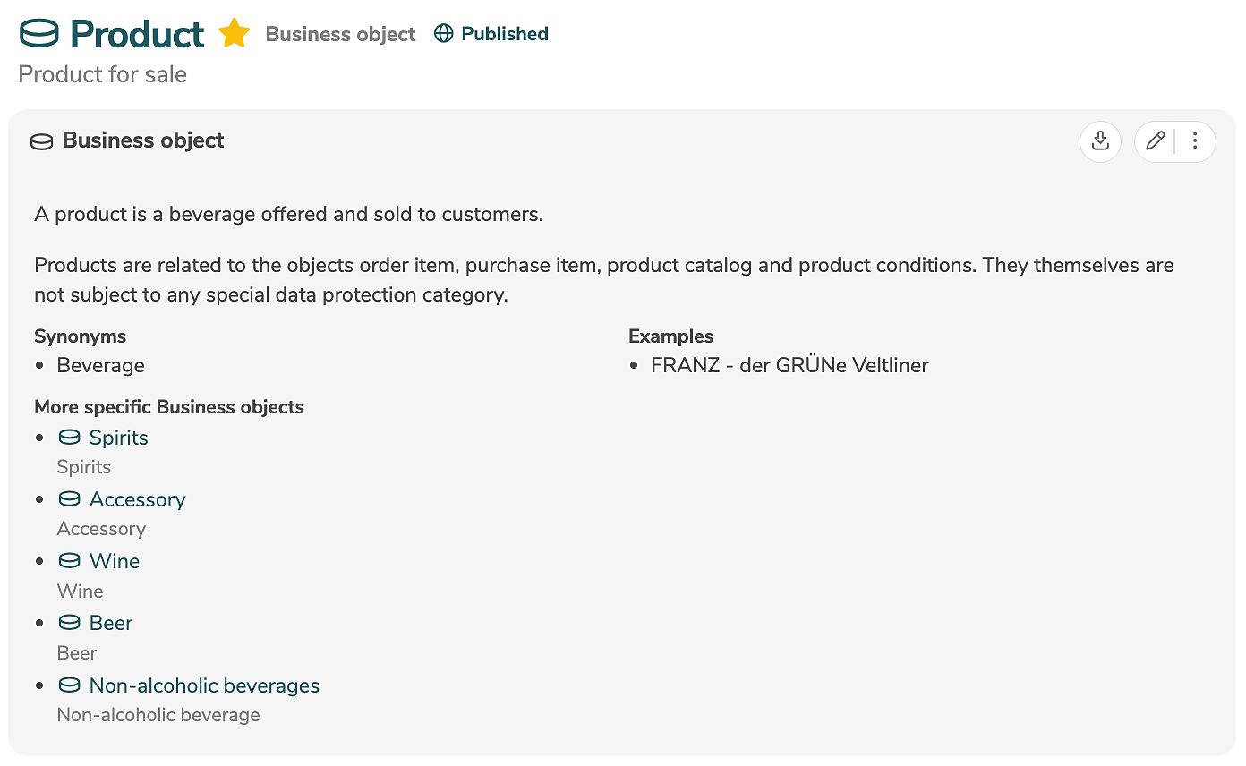
Main panel
The main panel displays the properties of the open element. Typically, these include the label, title, and textual description of the element. Additional properties and customer-specific properties can also be edited and displayed.
Metadata can be shared by email by clicking on "Share" in the menu. A new email containing the name and title of the element as well as a link to the element is created in the default email program.
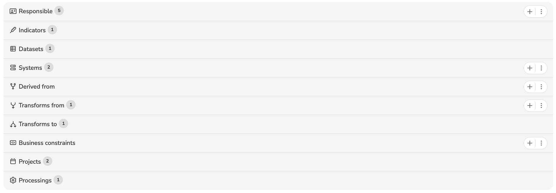
Subpanel
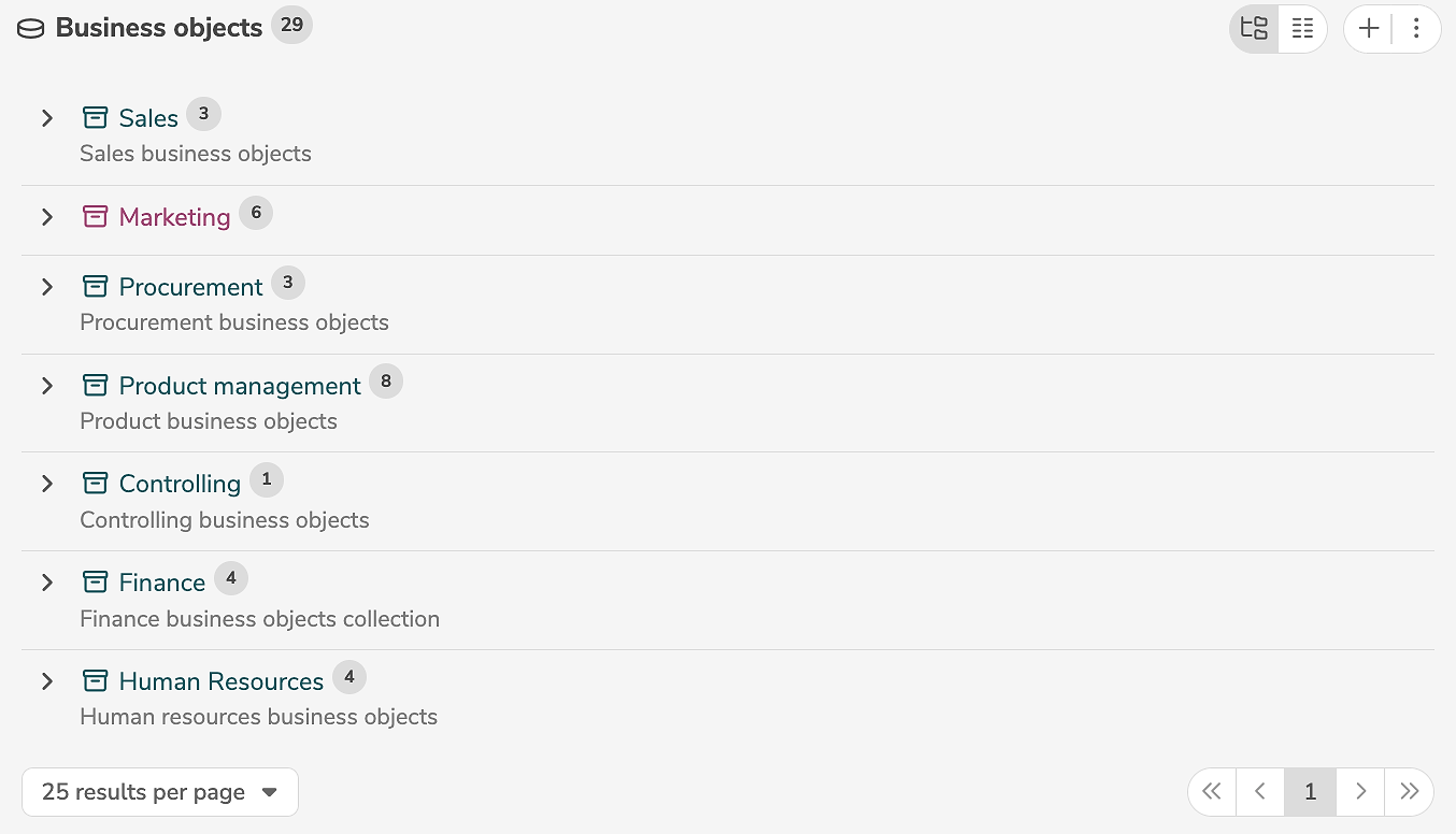
The subpanel displays the subordinate elements of the open element. These vary depending on which element is open.
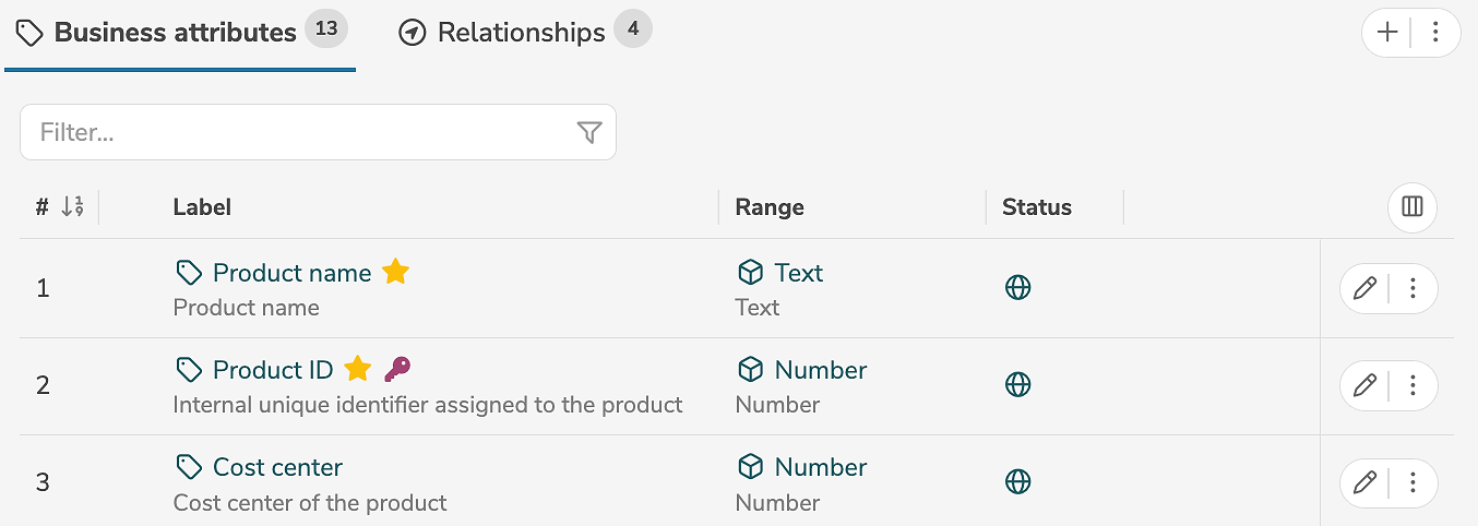
At the top level in a model, the main collections are displayed with their labels, as well as the number of elements they contain.
Outline view and details view
The display of elements can be customized at the level of collections and models.
By clicking on  the outline view or the details view can be selected.
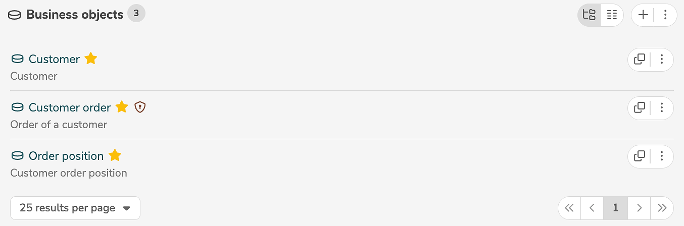
In the outline view, the elements are displayed in the collection hierarchy.
Empty collections are also displayed in the outline view.
In the details view, the elements are displayed sorted by label. The parent collection and the status of the element are also displayed.
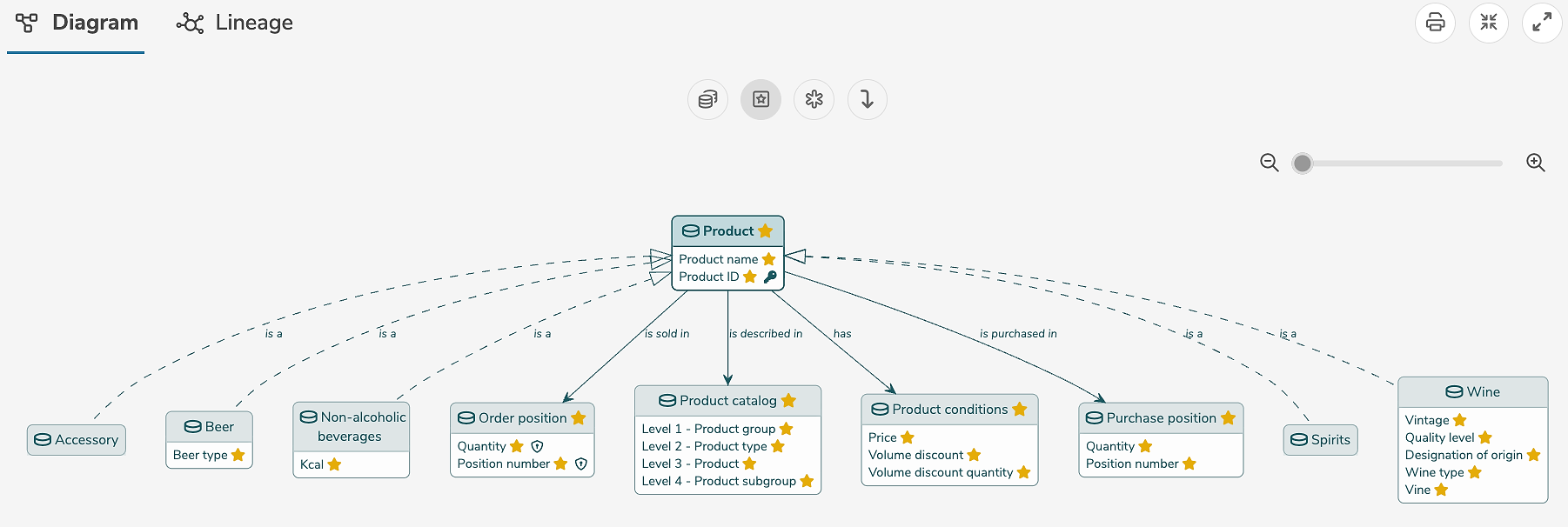
Diagram
The diagram is a graphical representation of the contained elements of the model and is automatically generated by the software. The diagram options configure which objects are shown in the diagram.
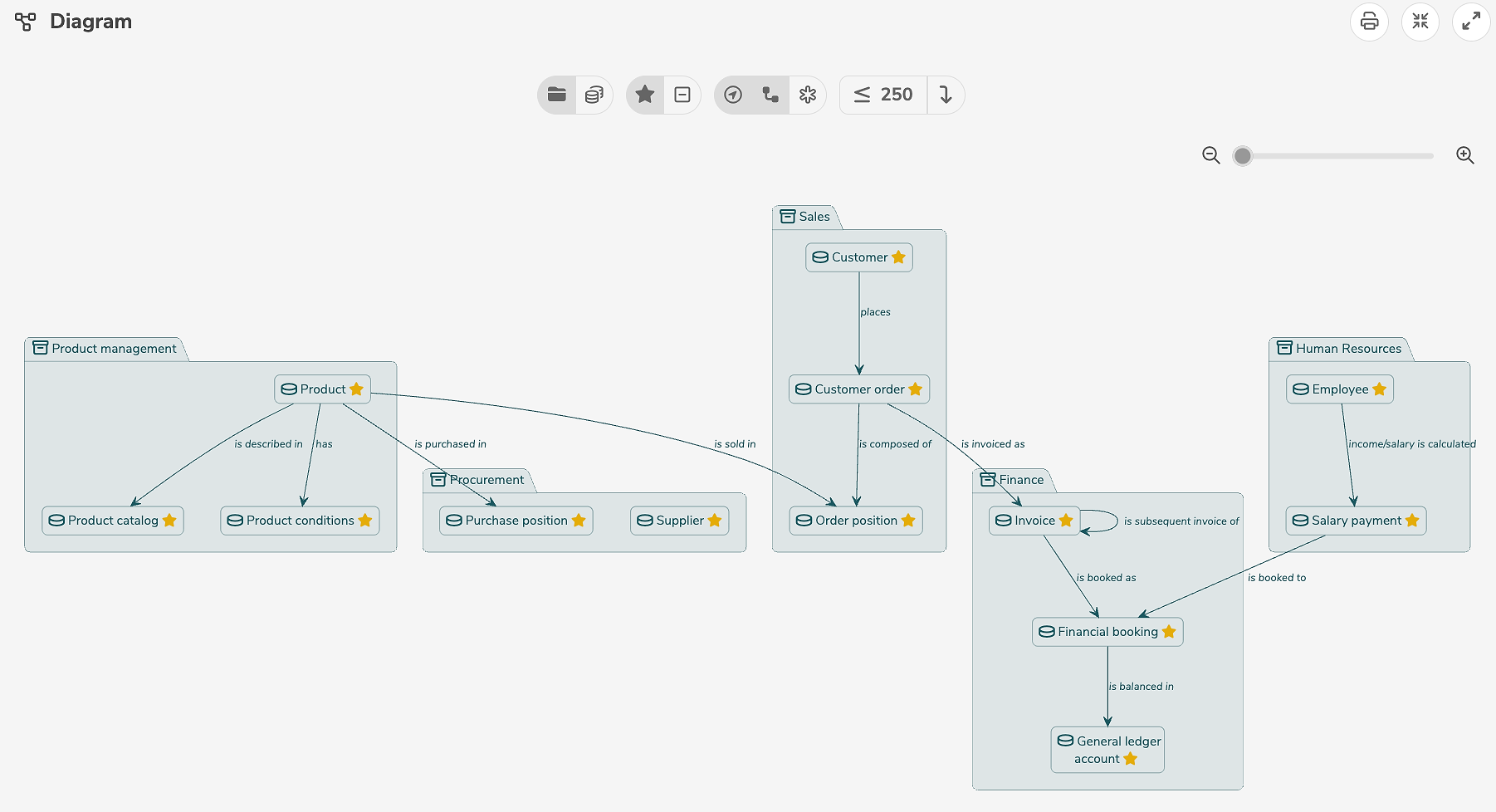
At the deeper levels within a model (e.g. representation of a single collection) all elements of the collection as well as elements of other collections linked by relationships are displayed. Elements from other collections are marked by the additional indication of their respective collections.
Within a diagram, two display options can always be selected in the upper right corner:
-
 formats the diagram to the correct display size. Clicking again resets the view.
The diagram can also be zoomed manually using the slider.
formats the diagram to the correct display size. Clicking again resets the view.
The diagram can also be zoomed manually using the slider. -
 expands the diagram to the whole window width. Clicking again resets the view.
In the graphical representation of elements, two different view options can be selected. On the one hand, a detailed diagram of the selected element can be viewed. On the other hand, a lineage diagram of the element is possible. Lineage representation is available for all elements where transitions, transformations, etc. can be defined (objects, attributes, reference values, etc.) and can be accessed by clicking on the "Lineage" tab.
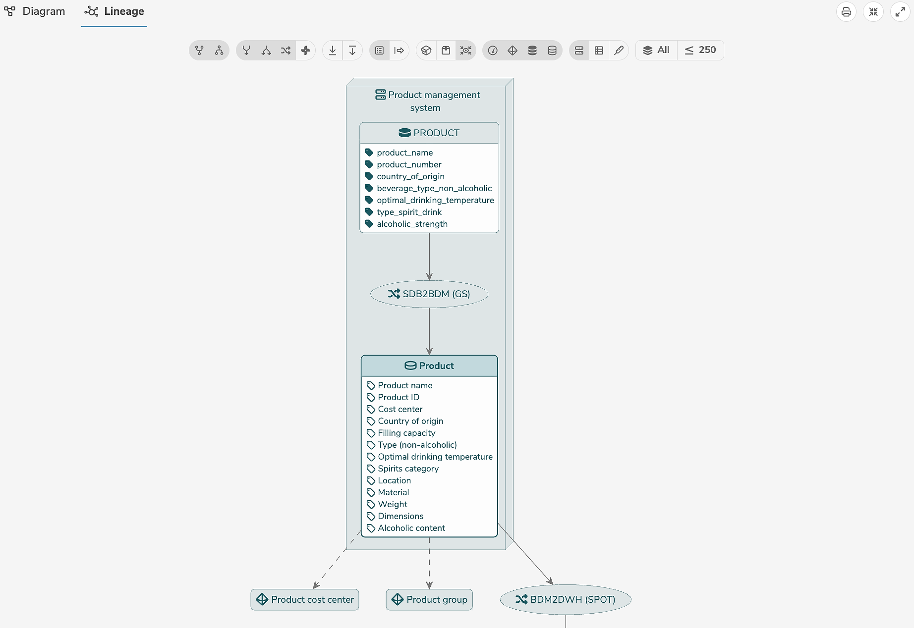
For a detailed explanation of the lineage diagram settings, see diagrams.
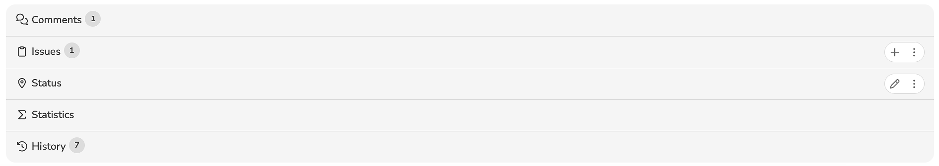
Additional tabs
The additional tabs show further subordinate elements and links to other elements. The additional tabs displayed depend on the type of the selected element.
In the collaboration area, the functions for cross-user collaboration are bundled, in particular the possibilities to post comments and to document issues. The version history and the current status of the element are displayed. In case there are pending approvals, the necessary information for approval can also be found here.