General functionality
Favorite, locked, and read-only
Elements can be marked as favorite, locked, or read-only.
Favorite
Clicking  marks the element as favorite, which gives the element preference in diagrams and in lists and enumerations.
Locked
Clicking  marks the element as locked, making it impossible to modify the element's business key (e.g. the label).
The lock can only be set or removed by an administrator.
marks the element as locked, making it impossible to modify the element's business key (e.g. the label).
The lock can only be set or removed by an administrator.
Read-only
Clicking  marks the element as read-only, making it impossible to modify the element or its subordinate elements.
Read-only is especially recommended when importing metadata via interfaces and can only be set or removed by an administrator.
marks the element as read-only, making it impossible to modify the element or its subordinate elements.
Read-only is especially recommended when importing metadata via interfaces and can only be set or removed by an administrator.
Text formatting
Descriptions and comments can be entered with formatted text (in Markdown). The editor supports different editing views:
- In the
Text editor, text is formatted as you type (WYSIWYG). Formatting can be applied using buttons. This view shows the finished, formatted result. - In the
Markdown editor, the text is displayed in Markdown without rendered formatting. - In the
Difference view, the current changes are shown compared with the last save.
The Text editor offers the following icons and functions:
| Symbol | Description |
|---|---|
 | Undo |
 | Redo |
 | Change block type |
 | Bold |
 | Italic |
 | Underline |
 | Superscript |
 | Subscript |
 | Inline code |
 | Bulleted list |
 | Numbered list |
 | Check list |
 | Insert link |
 | Insert asset link |
 | Insert image |
 | Insert thematic break |
 | Insert table |
 | Insert code block |
 | Insert MathML formula block |
 | Text editor |
 | Difference view |
 | Markdown editor |
An asset link is a direct internal link to an existing asset. The asset search can be used when inserting it.
To create a line break or paragraph, a blank line must be inserted between the sections to be separated.
Tables can also be created using Markdown. The columns are separated by | and the rows by -:
| Column 1  | Column 2  |
| --------- | --------- |
| Content 1 | Content 2 |
The alignment of the table (left-aligned, right-aligned or centered) can be customized by adding : before or after the -.
Time travel
Based on the versioning of all models and elements, a time travel functionality is supported. Using time travel, you can jump to any point in time in the past in order to view all elements in their state at the selected point in time. Note that the entire application switches to the selected point in time, whereby the links to other elements as well as their state at the selected point in time can be traced.
In time travel mode the application gets an additional frame in the color "Magenta" to better visualize the mode for the user. As long as dataspot is in time travel mode, elements cannot be edited. However, the metadata can be exported at any time.
Time travel can be started in the additional tab "History" to switch to the time of a specific version of an element. Alternatively, time travel can also be started by clicking the time travel icon in the menu bar, where the user can manually enter a specific point in time.
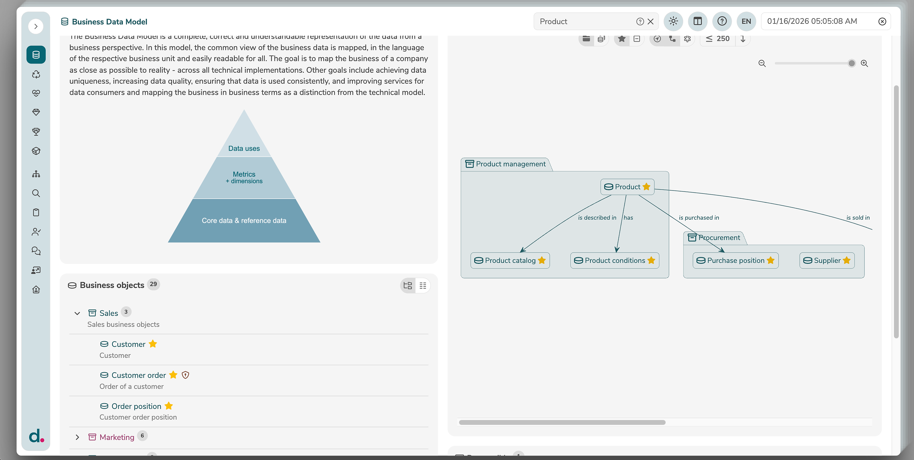
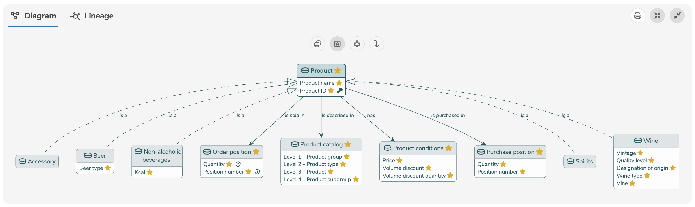
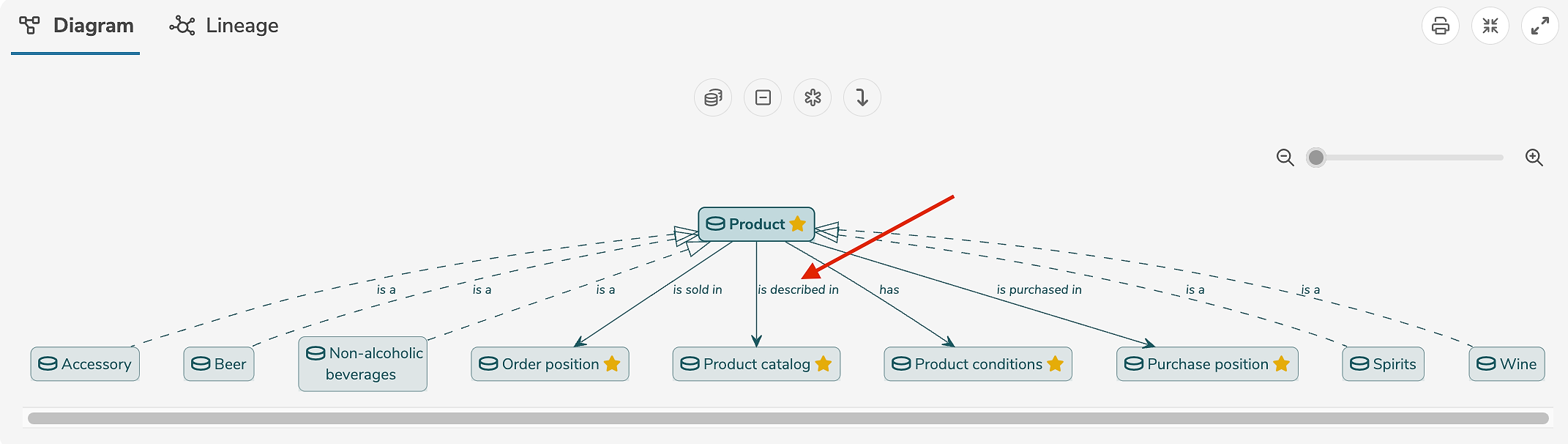
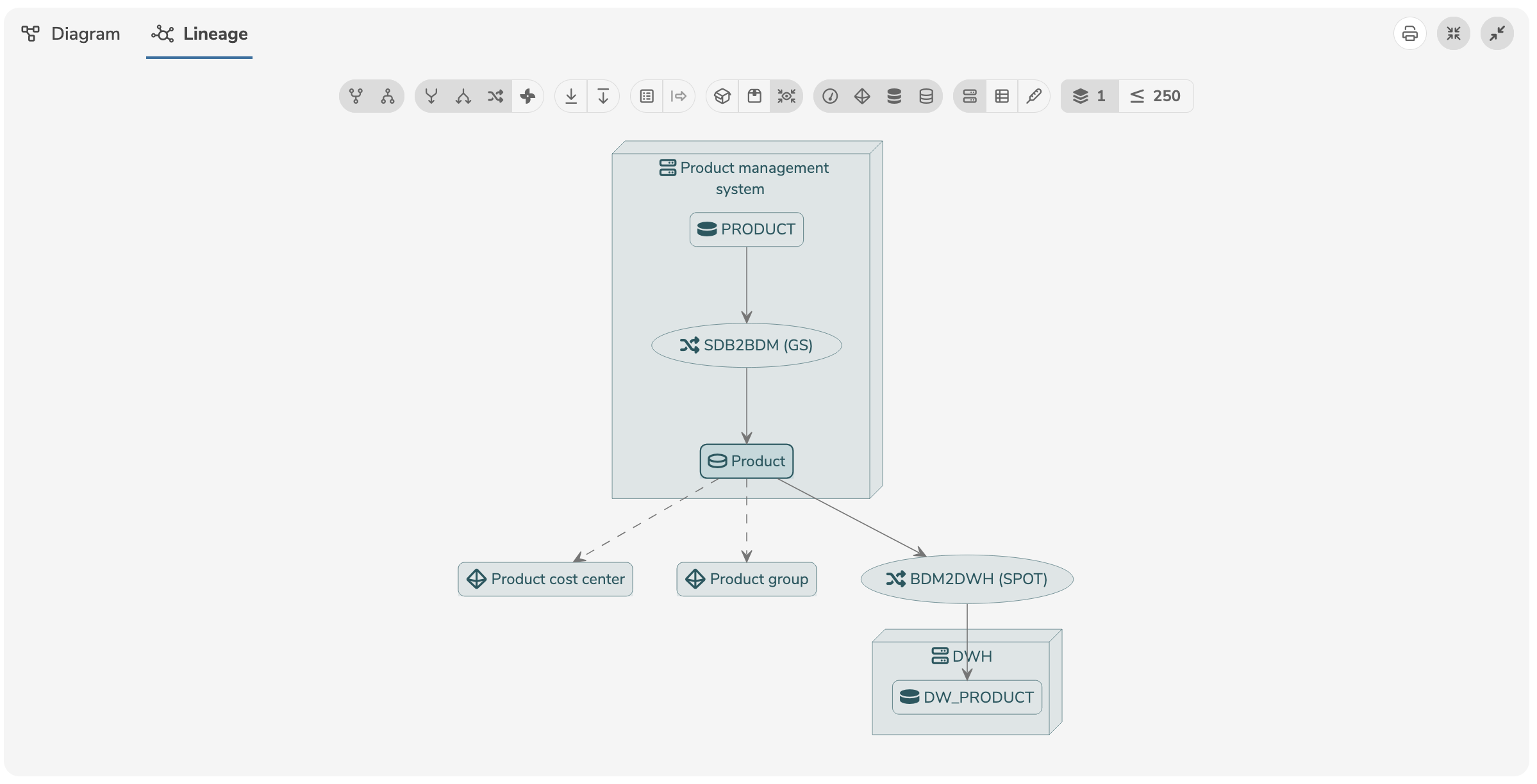
Diagrams
Diagrams visualize elements and their relations. On the one hand, a detailed diagram of the selected element can be viewed, and on the other hand, a lineage diagram of the element is possible. By clicking on the name of the diagram, the diagram can be collapsed or expanded.
Clicking  will adjust the diagram to the window size.
Clicking
will adjust the diagram to the window size.
Clicking  will expand the diagram to the full width of the application.
All diagrams can be exported and printed using the  icon.
icon.
Clicking on a label in the diagram directly opens the detailed view of the respective element. Relationships can be opened by clicking on the arrow.
The diagram can be customized and configured individually:
| Icon | Description |
|---|---|
 | Group elements by collections or hide collections |
 | Show as object model or as data model |
 | Show only favorite or all elements |
 | Show none, only favorite, or all attributes |
 | Show or hide relationships to other elements |
 | Show or hide links to other elements |
 | Show or hide cardinalities and roles |
 | Show or hide elements from subprojects |
 | Select the maximum number of displayed elements |
 | Order elements from top to bottom or from left to right |
Lineage representation is available for all elements where transitions, transformations, etc. can be defined (objects, attributes, reference values, etc.) and can be accessed by clicking on the "Lineage" tab.
The lineage diagram can be customized and configured individually:
| Icon | Show/Hide |
|---|---|
 | Derived from |
 | Derived to |
 | Transforms from |
 | Transforms to |
 | Transformation |
 | Rules |
 | Maps from |
 | Maps to |
 | Sub-elements |
 | Links of sub-elements |
 | Model names |
 | Superordinate names |
 | Transformationen and rule details |
 | Measures |
 | Dimensionens |
 | Technical objects |
 | Business objects |
 | Systems |
 | Datasets |
 | Indicators |
 | Levels |
If an option is displayed in color, it is active. If the option is displayed in gray, it is inactive.
The number of levels determines how many element levels are shown forwards and backwards. A level represents an element that is linked via a transformation, derivation or mapping.
The option Show only one level includes the element itself as well as an additional level.
Theme
A theme provides a set of design elements, styles and colors used to define the look and feel of the application. The current theme can be selected by clicking in the menu bar.
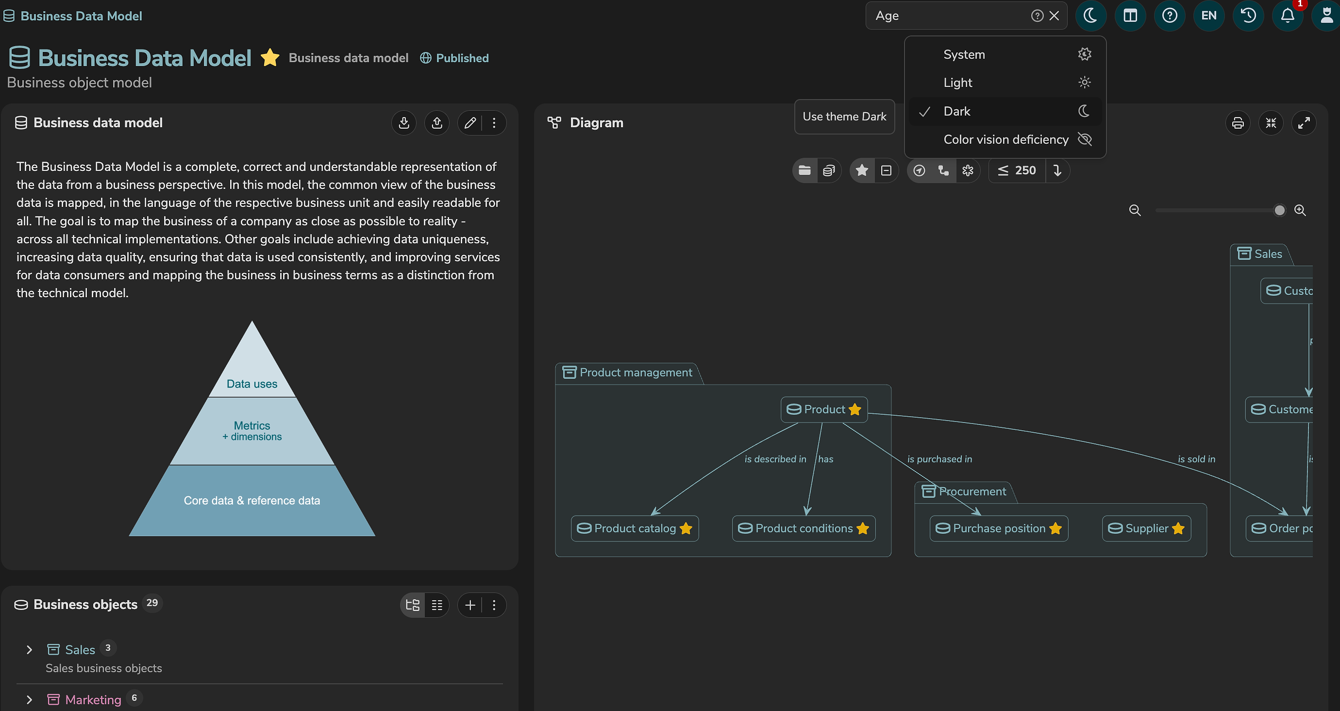
By clicking on "System", the theme is selected automatically based on the system settings of the end device.
The following themes are available, by default:
| Theme | Description |
|---|---|
Light (LIGHT) | Color scheme with light background and dark font. |
Dark (DARK) | Color scheme with dark background and light font. |
Color vision deficiency (CVD) | Color scheme with dark background and light font. Avoids colors that are difficult to see or distinguish for people with color vision deficiency. |
Each theme can be customized using annotations.
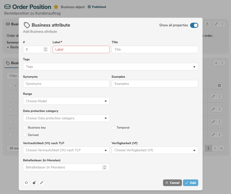
Simple and advanced editor
Dialogs for adding and editing elements can be switched between a simple and an advanced editor.
In the simple editor, only mandatory fields as well as fields marked as favorite are displayed.
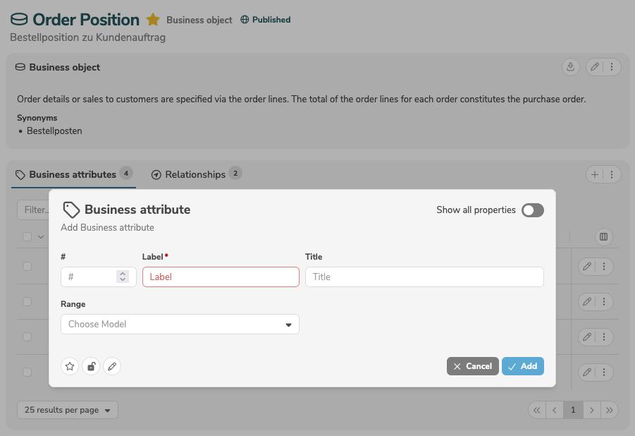
The advanced editor can be switched on and off by clicking the toggle "Show all properties". In the advanced editor, all fields (standard fields and additional, customer-specific fields) are displayed.
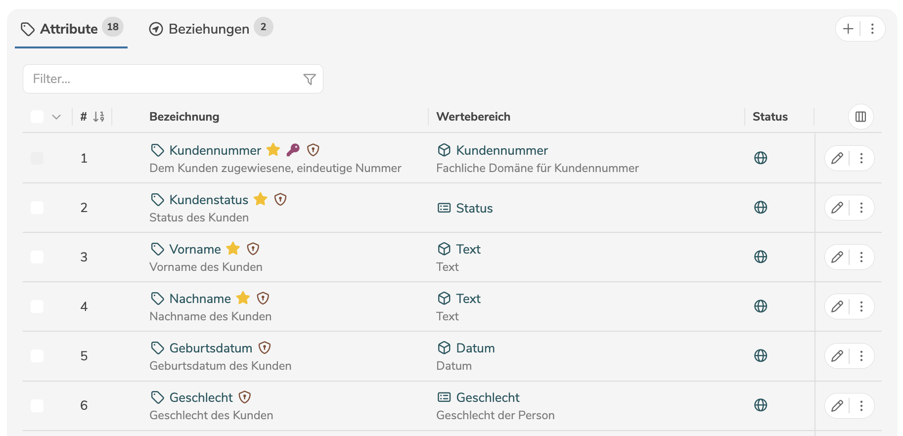
Column settings
The columns of a table or list can be adjusted individually.
The column settings are saved automatically and restored the next time the page is opened.
The arrangement and width of the columns can be adjusted:
- A column can be moved by clicking its column header with the mouse and dragging it to the desired position using "drag and drop".
- A column can be resized by clicking the right edge of its column header with the mouse and adjusting it by dragging.
To show and hide columns, the column menu is opened by clicking  .
.
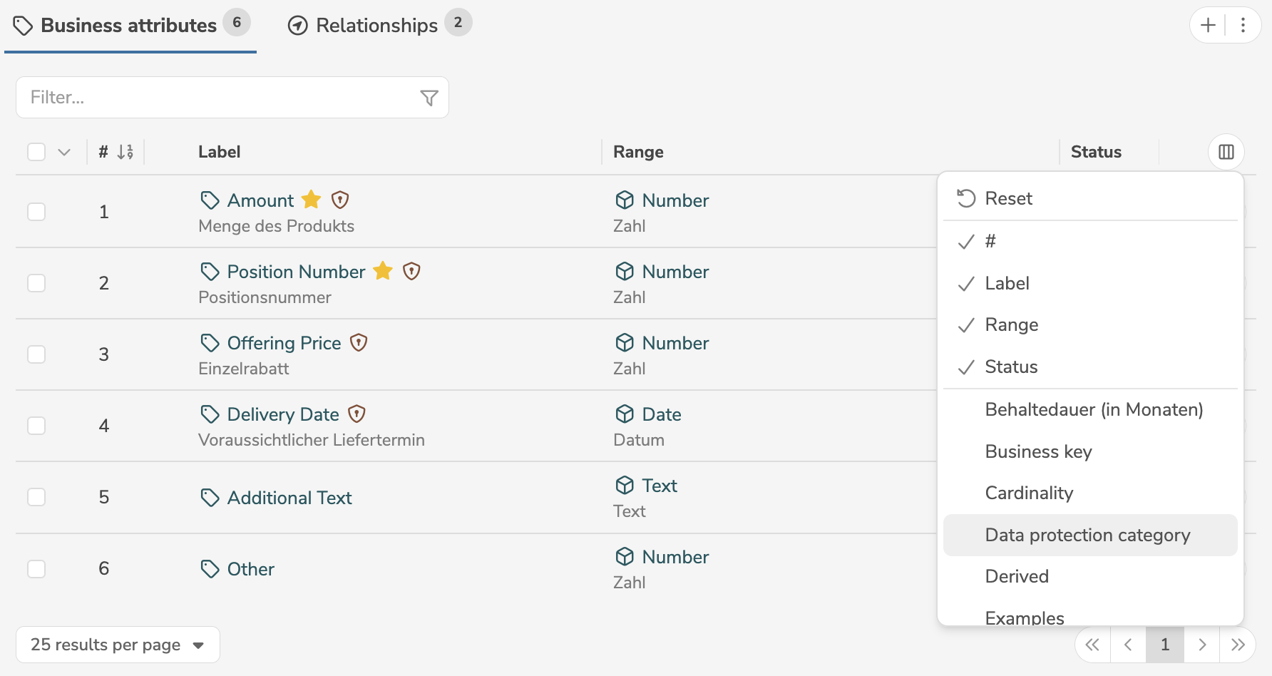
Selecting "Reset" discards all column settings (arrangement, width, displayed columns) and restores the default settings.
The column menu first shows all currently displayed columns. Below that, separated by a line, all hidden, available columns follow.
- Clicking a currently displayed column hides it.
- Clicking a hidden, available column displays it.
For layout reasons, no columns can be displayed whose data type (baseType) is TEXT (formatted text).
Bulk changes
Bulk changes allow multiple elements in the subpanel to be edited or deleted at the same time.
By clicking the checkboxes in the first column, all or individual elements can be selected.
Next to the checkbox in the column header, the dropdown list with all actions can be opened. The dropdown list shows all fields that can be edited by bulk changes. Alternatively, all selected elements can be deleted.
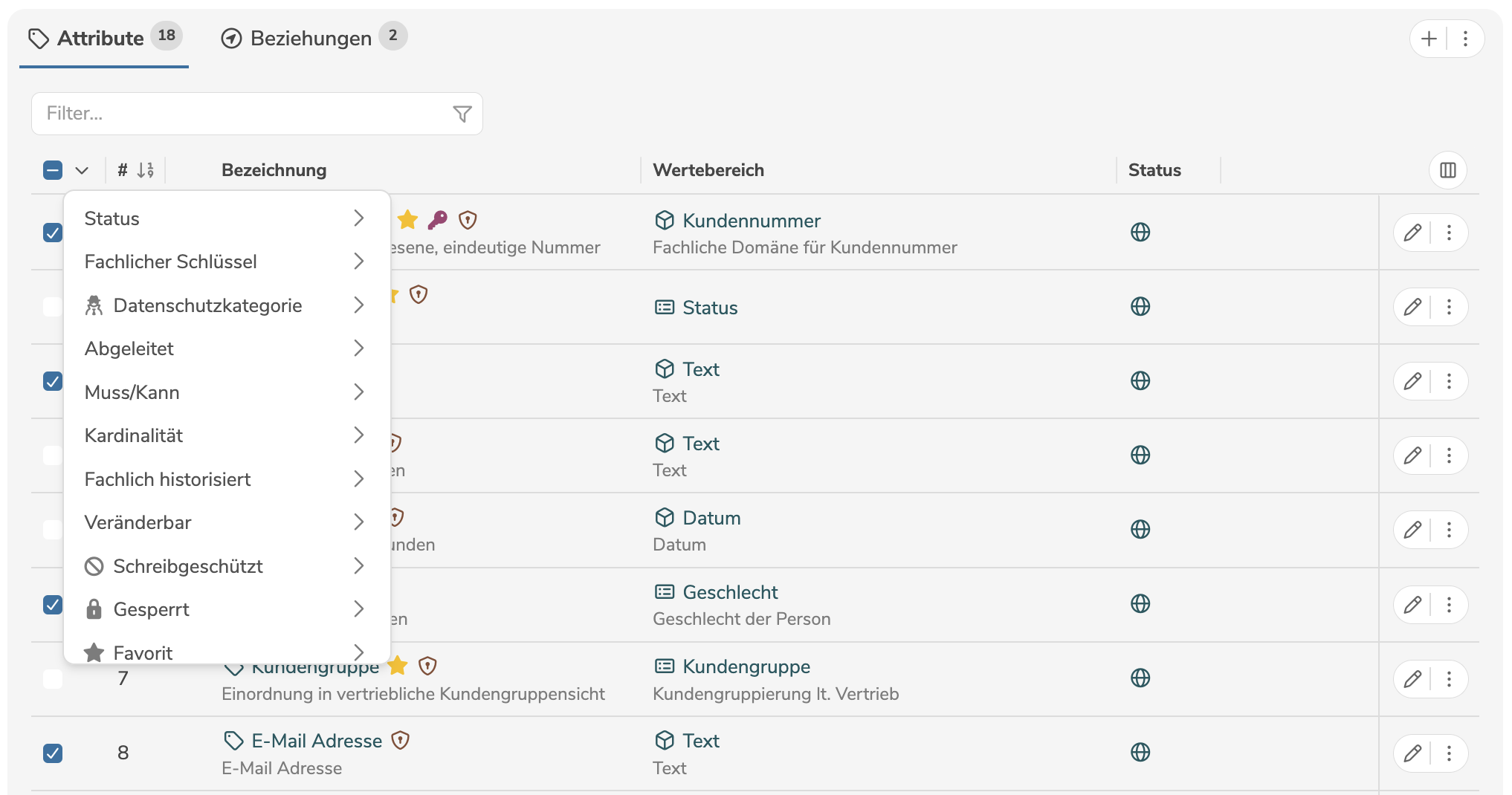
When using bulk changes, only fields that have a list of valid values (literals) or the data type (baseType) BOOLEAN (Yes/No) can be edited.
Both existing fields (properties) and customer-specific fields (customProperties) can be edited.
After the selection, a dialog opens to confirm the action.
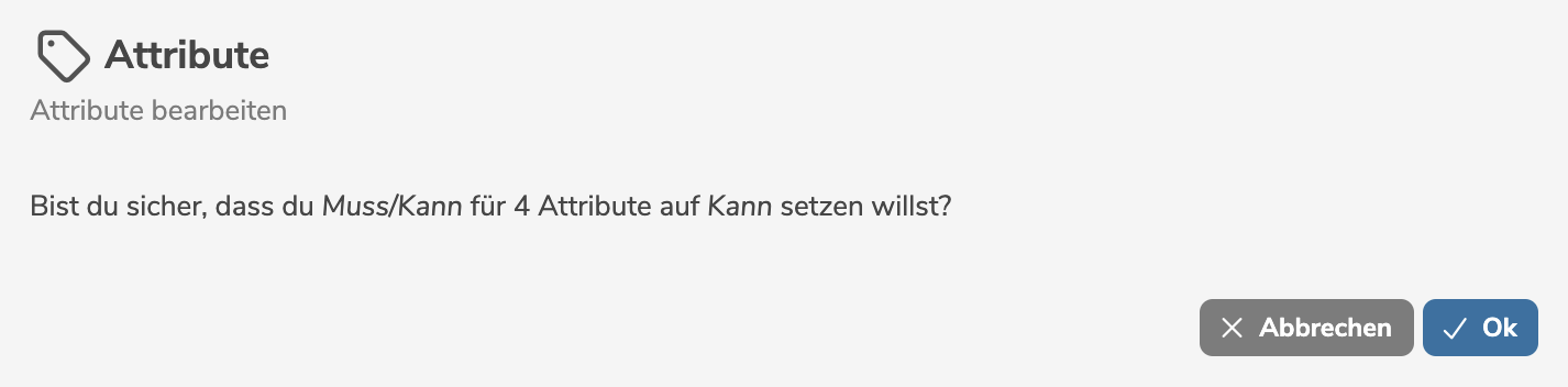
By clicking "OK", the change is applied to the selected elements.
When performing bulk changes as a user with the access level Editor, the permission is checked based on the assigned workflow.
Fields for which no permission is available are disabled in the dropdown list.
Duplicate
An element can be duplicated to create a copy of the element with a new label. When duplicating, all properties of the element as well as all subordinate elements and links to other elements are copied.
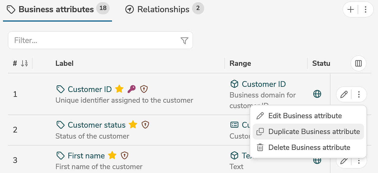
An element can be duplicated in the subpanel, by clicking the duplicate icon (or by selecting "Duplicate Element" in the menu) next to the element.
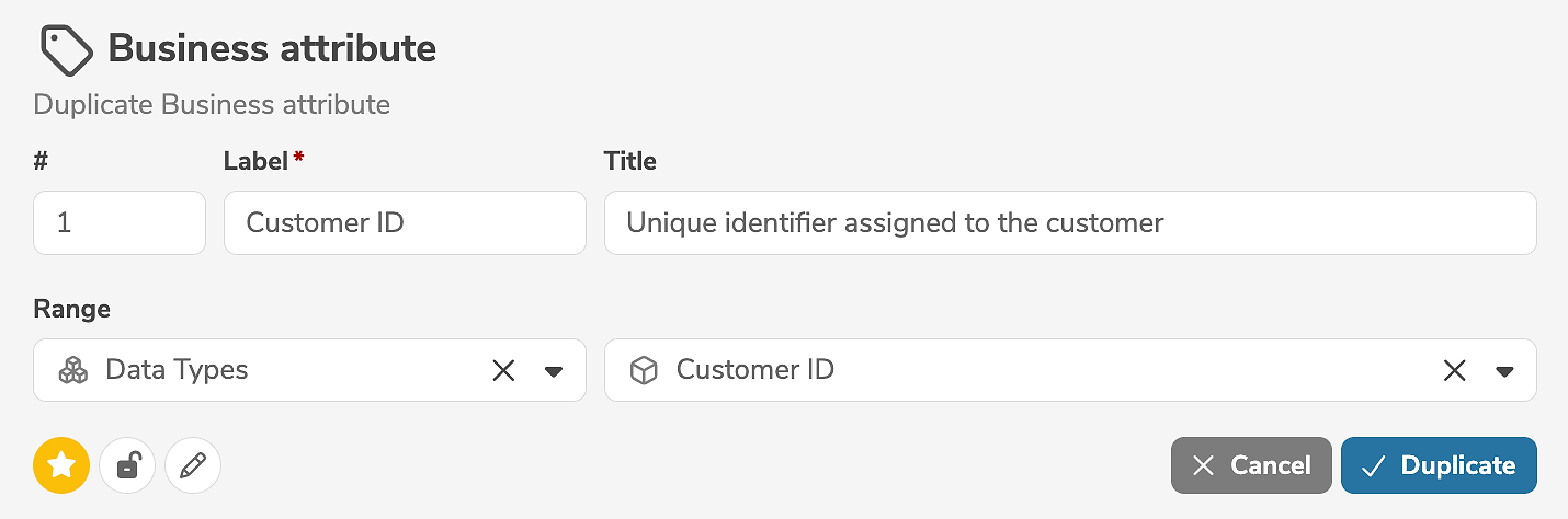
It is mandatory to change the label of the element. In addition, selected properties of the element can be edited.
Subordinate transformations are not taken into account when duplicating.
Clicking "Duplicate" creates the copy.
Notifications
Certain actions during processing can trigger automatic notifications to be sent to the responsible persons.
These notifications appear in the icon  in the menu bar and are also listed in the dashboard of the respective user.
For each status in a workflow, it is possible to configure which persons (based on their roles and responsibility) should be automatically notified when elements in this status are created, edited, or deleted. For each status transition in a workflow, it is possible to configure which persons (based on their roles and responsibility) should be automatically notified of the transition.
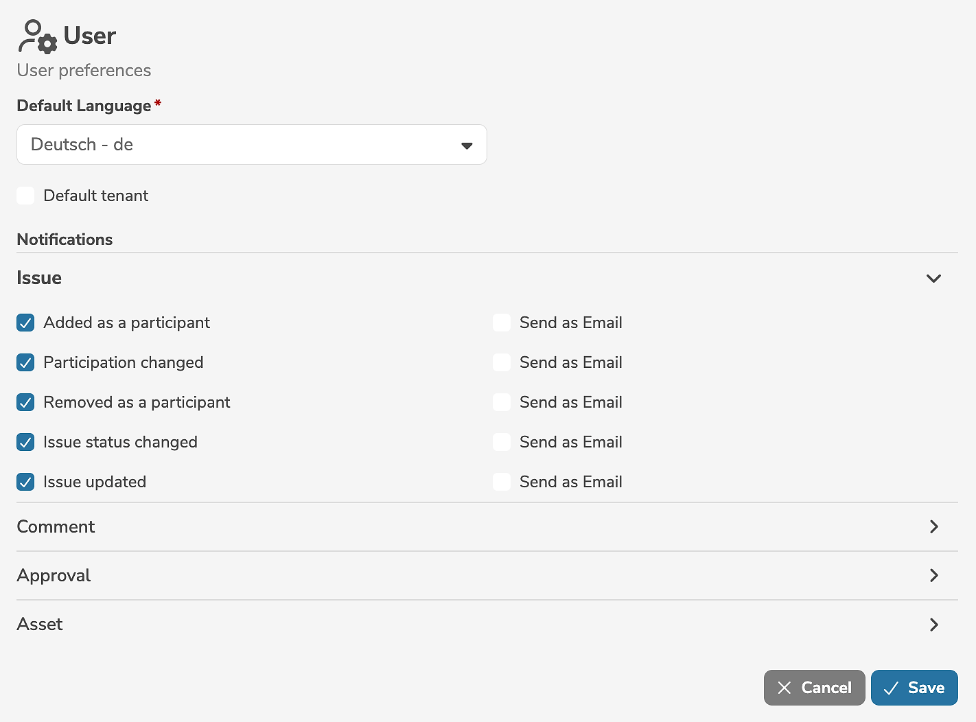
The individual notification settings of the user can be edited by selecting "User preferences..." in the user menu.
In the user preferences, issues, comments and approvals as well as assets can be explicitly configured for which actions (add, change, delete, etc.) the responsible user wants to be notified and whether additional notifications as emails are desired.
Access level
Each user and service user has a configured highest access level.
| Access level | Description |
|---|---|
Read Only | Users and service users with the access level Read Only may only read published metadata objects and are not allowed to edit or delete elements. |
Editor | Users and service users with the access level Editor may read metadata objects and, in compliance with the role-based responsibility and authorization concept, edit or delete metadata objects. Editors represent the regular, writing users of the application. They operate within the role-based responsibility and authorization concept and the workflow process.Editors can neither create, edit, nor delete users, service users or workflows. Editors can neither create nor delete models. |
Administrator | Users and service users with the access level Administrator may read, edit, or delete all metadata objects. Administrators have the most comprehensive permissions in the application. They may override the role-based responsibility and authorization concept and the workflow process. They may edit and delete all elements (regardless of responsibilities) and intervene in the workflow process by bypassing the defined rules (e.g. perform status transitions without a required approval).Administrators can create, edit, and delete models, users, service users and workflows. They can configure and customize the application. |
A user can change their access level in the user interface to a lower level than their configured highest level.
The current access level can be set in the personal user menu by clicking on the icon  in the menu bar.
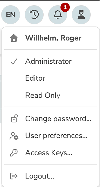
For example, a user with the configured highest access level Administrator might temporarily change their access level to Editor in order to work as a regular user without special privileges.
Version information
The current version information can be displayed or verified by hovering the mouse cursor over the dataspot logo in the lower left corner of the sidebar.
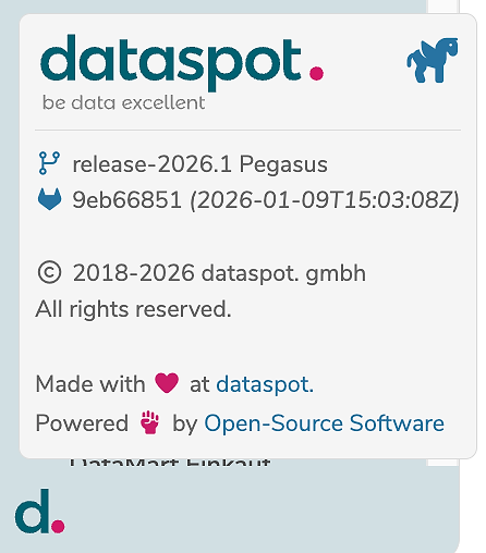
By clicking on "Open-Source Software" the list of open-source libraries and technologies used is displayed.