Specification
The application can be configured using annotations in YAML. The following sections contain a specification of all keys used to modify existing element types and properties as well as to add new properties.
properties
The key properties defines a list of modified, existing properties of an element type.
Each existing property is specified using the technical name (according to the metamodel).
# Rename existing property 'title'
BusinessAttribute:
  properties:
    title:
      label:
        en: Caption
The key label defines the label of the property.
Only properties that are defined in the standard metamodel may be specified and adapted in the list.
Properties that are not defined in the metamodel must be configured as customer-specific customProperties.
customProperties
The key customProperties defines a list of new, customer-specific properties of an element type.
Each new property is specified using a technical name.
This technical name must uniquely identify the property and may not conflict with other existing properties of the element type.
# New properties 'confidentiality' and 'priority'
BusinessAttribute:
  customProperties:
    confidentiality:
      label:
        en: Confidentiality
      baseType: STRING
    priority:
      label:
        en: Priority
      baseType: INTEGER
The key baseType defines the datatype of the property.
New properties become part of the metamodel. In the user interface, they are displayed as input fields for the respective element. New properties are also taken into account in the programming interfaces during import and export.
The key customProperties may only be defined for element types that inherit from Asset in the hierarchy, as well as for Issue.
The technical name of a custom property must start with a letter, : or _ and may further only contain letters, digits, ., :, - or _ but no spaces or other special characters (/, &, ?, <, >, +, =, etc.).
customFunctions
The key customFunctions defines a list of custom functions of an element type.
Each custom function specifies the property href with a link to an external website or application and is displayed in the user interface as an entry in the element's menu.
The external website or application is opened by clicking on the entry in the menu.
Asset:
  customProperties:
  # Customer-specific property `additionalText`
    additionalText:
      label:
        de: Zusatztext
        en: Additional text
      baseType: TEXT

  customFunctions:
    # Custom function to search for the label on the internet
    searchGoogle:
      label:
        de: Google Suche
        en: Google Search
      title:
        de: Suche nach der Bezeichnung in Google
        en: Search for the label in Google
      icon: brand-google
      href: "https://www.google.com/search?q=${this.label}"
    # Custom function to translate the customer-specific property `additionalText`
    translateAdditionalText:
      label:
        de: Zusatztext übersetzen
        en: Translate additional text
      title:
        de: Den Zusatztext mithilfe von Google translate übersetzen
        en: Translate the additional text using Google translate
      icon: language
      href: "https://translate.google.com/?sl=de&tl=en&text=${this.additionalText}&op=translate"
In the user interface, custom functions are displayed as entries in the element's menu:
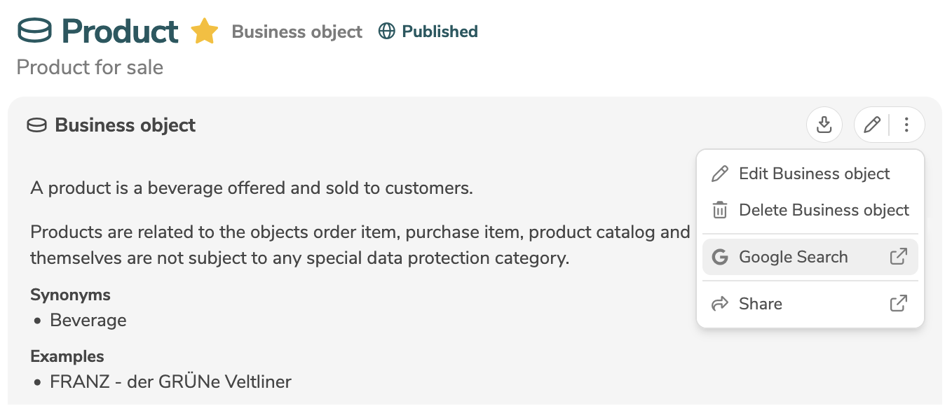
Optionally, the link can be parameterized using placeholders to insert values of the element (e.g. label, additional text) at specific positions.
Placeholders are defined with ${} and refer to a value of the element.
When clicking in the menu of the selected element, the placeholders are replaced by the actual values of the element.
All properties of the element as well as a few other selected values can be specified:
| Placeholder | Description |
|---|---|
${this.*} | By using this. followed by the technical name of a property, all properties that are defined in the standard metamodel (e.g. ${this.label}, ${this.description}, ${this.tags}) as well as all customer-specific properties (e.g. ${this.additionalText}) can be specified. |
${user.userName} | The name of the current user. |
${user.loginId} | The login ID of the current user. |
${tenant.tenantName} | The name of the selected tenant. |
${tenant.tenantId} | The UUID of the selected tenant. |
The entry in the menu is only displayed if all placeholders specified in href can be resolved and have a value.
For example, if the placeholder ${this.additionalText} is specified in href, the custom function is only displayed in the element's menu if the property additionalText in the element is not empty.
label
The key label with the German label as its direct value is deprecated and should no longer be used.
Existing usages should be replaced with the key de within label.
The key labelEn with the English label as its direct value is deprecated and should no longer be used.
Existing usages should be replaced with the key en within label.
The key label defines the multilingual label of an element type, a stereotype, a property or the value of a list (literals).
The labels are displayed in the user interface (e.g. next to the corresponding input fields or as values in a dropdown list) as well as in the upload/download in Excel and in reports.
The label can be defined in multiple languages.
The language codes are specified within label along with the multilingual labels.
dedefines the label in Germanendefines the label in Englishfrdefines the label in French
# Rename element type 'BusinessAttribute'
BusinessAttribute:
  label:
    de: Eigenschaft | Eigenschaften
    en: Property | Properties
    fr: Propriété | Propriétés
For element types and stereotypes (but not for properties), the plural label can be specified, separated by |.
The plural label is automatically displayed in the user interface when the plural form is required.
# Rename property 'title' and define new property 'confidentiality'
BusinessAttribute:
  properties:
    title:
      label:
        de: Überschrift
        en: Caption
  customProperties:
    confidentiality:
      label:
        de: Vertraulichkeit
        en: Confidentiality

# Define labels of `literals`
Derivation:
  properties:
    qualifier:
      literals:
        SPOT:
          label:
            de: SPOT
            en: SPOT
        GOLD:
          label:
            de: Golden Source
            en: Golden record
Element types can be stereotyped with the key stereotype.
The key label defines a separate label for each stereotype.
title
The key title with the German description as its direct value is deprecated and should no longer be used.
Existing usages should be replaced with the key de within title.
The key titleEn with the English description as its direct value is deprecated and should no longer be used.
Existing usages should be replaced with the key en within title.
The key title defines the multilingual description of an element type, a stereotype, a property or the value of a list (literals).
The descriptions are displayed as tooltips in the user interface (e.g. mouse over the corresponding input fields or values in a dropdown list).
The description can be defined in multiple languages.
The language codes are specified within title along with the multilingual descriptions.
dedefines the description in Germanendefines the description in Englishfrdefines the description in French
# Property 'confidentiality' with description
BusinessAttribute:
  customProperties:
    confidentiality:
      label:
        de: Vertraulichkeit
        en: Confidentiality
        fr: Confidentialité
      title:
        de: Die Vertraulichkeitsklassifikation eines Attributs
        en: The confidentiality classification of an attribute
        fr: Le niveau de confidentialité d'un attribut
Element types can be stereotyped with the key stereotype.
The key title defines a separate description for each stereotype.
icon
The key icon defines the icon of an element type, a property or the value of a list (literals).
The icons are displayed in the user interface (e.g. next to the corresponding input fields or next to the values in a dropdown list).
The application uses icons from the Font Awesome library (version 7.1).
The names of the icons specified in Font Awesome can be used directly in the configuration.
# change icon of element type 'BusinessAttribute'
BusinessAttribute:
  icon: unicorn

# define icons of `literals`
Measurement:
  properties:
    qualityRating:
      label:
        en: Quality rating
      literals:
        EXCELLENT:
          label:
            en: Excellent
          icon: traffic-light-go
        FAIR:
          label:
            en: Fair
          icon: traffic-light-slow
        BAD:
          label:
            en: Bad
          icon: traffic-light-stop
Most icons are available in the styles solid, regular (default), light and thin.
The style is inserted with a hyphen before the name of the icon.
If no style is specified, the style regular is applied automatically.
# change icon of element type 'BusinessAttribute'
BusinessAttribute:
  icon: solid-unicorn
To use an icon from the category "Brands", brand is inserted with a hyphen before the name of the icon (e.g. brand-facebook).
Element types can be stereotyped with the key stereotype.
The key icon then defines distinct icons for each stereotype.
If, due to technical reasons, an icon cannot be displayed correctly, it is replaced with the icon  .
.
baseType
The key baseType defines the datatype of a property.
In the user interface, the datatype determines which values can be entered in the corresponding input field.
baseType | Description | User interface |
|---|---|---|
STRING | String |  |
TEXT | Formatted Text |  |
DECIMAL | Decimal |  |
INTEGER | Integer |  |
BOOLEAN | Boolean |  |
BINARY | Binary | 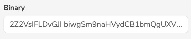 |
DATE | Date | 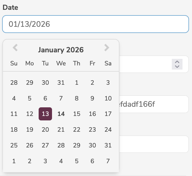 |
TIME | Time |  |
DATETIME | Datetime | 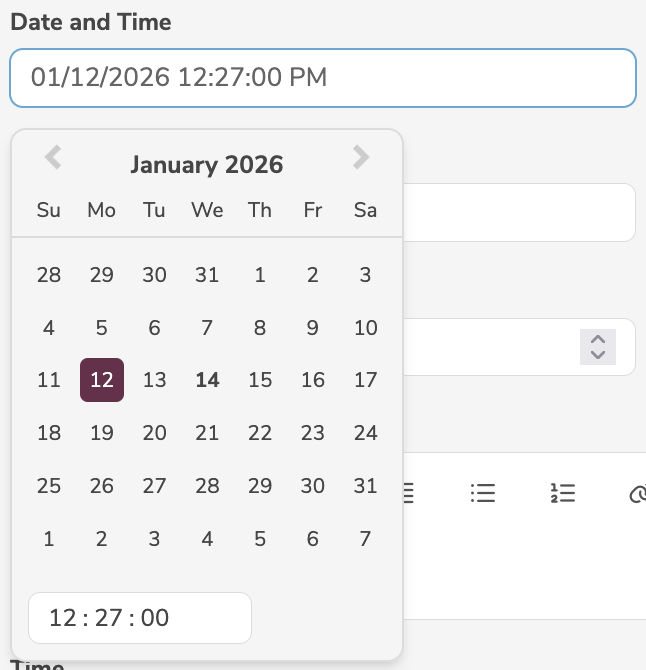 |
DURATION | Duration |  |
CODE | Code |  |
ID | Id |  |
# new property 'confidentiality' with datatype `BOOLEAN`
BusinessObject:
  customProperties:
    confidentiality:
      label:
        en: Confidentiality
      baseType: BOOLEAN
If both the key baseType and the key literals are defined, the key baseType is ignored.
Depending on the baseType, the properties are stored differently in the database.
If the baseType of a specific property is changed, values that were previously stored with the original baseType may not be processed correctly, as their stored value may be incompatible with the new baseType.
Therefore, the values of all affected properties should be deleted before changing baseType.
literals
The key literals defines the list of valid values of a property.
In the user interface, the corresponding input field is displayed as a dropdown list.
Each value has a technical name and label.
The label is displayed in the dropdown list in the user interface as well as in the upload/download in Excel.
The technical name is used in all other interfaces (metadata REST/API, metadata upload/download).
# new property 'direction' with list of valid values
BusinessAttribute:
  customProperties:
    direction:
      label:
        en: Direction
      literals:
        LEFT:
          label:
            en: Left
          icon: left
          order: 1
        RIGHT:
          label:
            en: Right
          icon: right
          order: 2
It is possible to modify certain existing properties that have already defined literals.
Existing values can be removed or renamed and new values can be added.
The following table lists existing properties that can be overwritten with literals.
| Element type | Property | literals (label) |
|---|---|---|
Processing | lawfulBasis | CONSENT (Consent)CONTRACT (Fulfillment of a contract)LEGAL (Legal obligation)VITAL (Vital interest)PUBLIC (Public interest)LEGIT (Legitimit interest) |
Dataset | accrualPeriodicity | 001 (kontinuierlich)002 (täglich)003 (wöchentlich)004 (14-tägig)005 (monatlich)006 (quartalsweise)007 (halbjährlich)008 (jährlich)009 (nach Bedarf)010 (unregelmäßig)011 (nicht geplant)012 (unbekannt) |
Distribution | format | CSV (CSV)HTML (HTML)JSON (JSON)DOC (DOC)XLS (XLS)RDF (RDF)RSS (RSS)TXT (TXT)XML (XML)PDF (PDF) |
Measure | unitMeasure | NUM (Number Count)YEAR (Years)PC (Prozent)EUR (Euro) |
Measure | calculationDate | EOM (End of month)EOD (End of day) |
Derivation | qualifier | SPOT (SPOT)GOLD (Golden record) |
Composition | qualifier | GROUP (Group)FILTER (Filter) |
Usage | qualifier | IN (Input)OUT (Output) |
Measurement | qualityRating | EXCELLENT (Excellent)GOOD (Good)FAIR (Fair)POOR (Poor)BAD (Bad) |
Person | gender | 0 (not known)1 (male)2 (female)9 (not applicable) |
Enumeration | stringType | ALPHABETIC (Alphabetic)NUMERIC (Numeric)ALPHANUMERIC (Alphanumeric) |
The key literals replaces the entire list for existing properties.
Therefore, all values that should not be deleted must be specified again in the new list.
# remove 'EOM', add 'EOY', keep 'EOD'
Measure:
  properties:
    calculationDate:
      literals:
        EOD:
          label:
            en: End of day
          order: 1
        EOY:
          label:
            en: End of year
          order: 2
If both the key baseType and the key literals are defined, the key baseType is ignored.
If the key cardinality has the value MANY, the dropdown list in the user interface allows multiple selection.
order
The key order defines the sort order of values of a list (literals) or of groups.
The sort order is taken into account in the user interface (e.g. order of the values in a dropdown list or the order of groups) as well as in the upload/download in Excel and in reports.
The assigned ordinal number must be unique within the defined values.
# Definition of sorted literals for a field
BusinessAttribute:
  customProperties:
    priority:
      label:
        en: Priority
      literals:
        low:
          label:
            en: Low
          order: 10
        medium:
          label:
            en: Medium
          order: 20
        high:
          label:
            en: High
          order: 30
cardinality
The key cardinality defines the cardinality of a property.
The cardinality determines whether a property can hold a single or multiple values.
cardinality | Description | User interface |
|---|---|---|
ONE (default) | The input field allows single selection |  |
MANY | The input field allows multiple selection |  |
# new property 'color' with multiple selection
BusinessAttribute:
  customProperties:
    color:
      label:
        en: Color
      cardinality: MANY
      literals:
        RED:
          label:
            en: Red
        GREEN:
          label:
            en: Green
        BLUE:
          label:
            en: Blue
Depending on the cardinality, the properties are stored differently in the database.
If the cardinality of a specific property is changed, values that were previously stored with the original cardinality may not be processed correctly, as their stored value may be incompatible with the new cardinality.
Therefore, the values of all affected properties should be deleted before changing cardinality.
width
Deprecated
The key width defines the width of a property.
In the user interface, the width is taken into account when arranging the corresponding input fields.
width | Description |
|---|---|
1 (default) | Two input fields fit next to each other in one line, i.e. the input field occupies only half the width. |
2 | Only one input field fits into one line, i.e. the input field occupies the full width. |
# New property 'priority' with full width
BusinessAttribute:
  customProperties:
    priority:
      label:
        en: Priority
      width: 2
If the key baseType has the value TEXT, the key width is automatically set to 2.
defaultValue
The key defaultValue defines the default value of a property.
In the user interface, the corresponding input field is automatically set to the default value, if no value is entered.
# new property 'dataCategory' with default value
BusinessObject:
  customProperties:
    dataCategory:
      label:
        en: Data category
      defaultValue: master
      literals:
        transactional:
          label:
            en: Transactional data
        master:
          label:
            en: Master data
readOnly
The key readOnly [true, false; default: false] defines whether a customer-specific property is read-only.
In the user interface, the corresponding input field is displayed but may only be edited by a user with the access level Administrator.
# new read-only property 'priority'
BusinessAttribute:
  customProperties:
    priority:
      label:
        en: Priority
      readOnly: true
The key readOnly may only be defined for new, customer-specific properties, but not for existing properties.
hidden
Deprecated
The key hidden [true, false; default: false] defines the visibility of a customer-specific property.
In the user interface, the corresponding input field is not displayed.
However, the customer-specific property is read and written in the interfaces (metadata REST/API, metadata upload/download).
# Hidden new property 'priority'
BusinessAttribute:
  customProperties:
    priority:
      label:
        en: Priority
      hidden: true
Hidden customer-specific properties contain data (e.g. internal, technical or confidential information) that should not be displayed in the user interface, but can be stored, imported and exported in the interfaces.
The key hidden may only be defined for new, customer-specific properties, but not for existing properties.
mandatory
The key mandatory [true, false; default: false] defines whether a customer-specific property is mandatory.
In the user interface, the corresponding input field is displayed as a mandatory field, i.e. the element may not be saved as long as there are empty mandatory fields.
Mandatory input fields are always displayed in the simple editor.
# Mandatory property
BusinessAttribute:
  customProperties:
    priority:
      label:
        en: Priority
      mandatory: true
The key mandatory may only be defined for new, customer-specific properties, but not for existing properties.
If the key baseType has the value BOOLEAN, the key mandatory may not have the value true.
group
The key group defines the group of a property.
In the user interface, the corresponding input fields are arranged according to these groups.
The available groups are first defined with the key groups in the element type.
Properties can then be specified, referencing the previously defined groups with the key group.
# New groups 'info' and 'additionalData' with properties 'priority', 'caption' and 'confidentiality'
BusinessAttribute:
  groups:
    info:
      label:
        en: Information
      icon: circle-exclamation
      order: 10
    additionalData:
      label:
        en: Additional Data
      icon: unicorn
      order: 20
  customProperties:
    priority:
      label:
        en: Priority
      group: info
    caption:
      label:
        en: Caption
      group: info
    confidentiality:
      label:
        en: Confidentiality
      group: additionalData
In the user interface, the defined groups are displayed while taking into account the labels, icons and order.
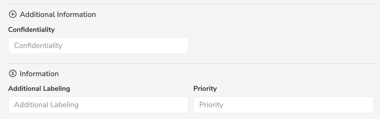
Some elements (e.g. attributes or measures) have a tab "Computation" in the main panel of the element.
The predefined group computation can be used to display customer-specific properties in this tab:
# Display property 'confidentiality' in tab "Computation"
BusinessAttribute:
  customProperties:
    confidentiality:
      label:
        en: Confidentiality
      baseType: BOOLEAN
      group: computation
stereotype
The key stereotype defines the stereotypes of an element type.
Stereotypes allow element types to be further classified.
In the user interface, the defined stereotypes are automatically displayed as a dropdown list when adding or editing an element.
The key label defines the label of the dropdown list.
The key literals defines the stereotypes, i.e. the entries of the dropdown list.
If a stereotype is selected from the list, then this stereotype is applied to the element.
For each stereotype, distinct labels, descriptions and icons can be defined with the keys label, title and icon.
Furthermore, for each stereotype, existing properties can be modified with the key properties and new, customer-specific properties can be added with the key customProperties.
The label or icon of the stereotype, as well as the modified or added properties, are applied to elements of the element type, only if the respective stereotype is selected.
Thus, there are two ways to configure element types:
- If the customizations (
label,title,icon,properties,customProperties, etc.) are defined directly on the element type, then they are applied to all elements of the element type. - If the customizations (
label,title,icon,properties,customProperties, etc.) are defined per stereotype, then they are applied to all elements of the element type where the respective stereotype is selected.
# stereotypes 'schema' and 'program' for collections
Collection:
  properties:
    stereotype:
      label:
        en: Collection type
      literals:
        schema:
          label:
            en: Database schema | Database schemas
          icon: folder-tree
        program:
          label:
            en: Program | Programs
          icon: solid-screen-users
          customProperties:
            sponsor:
              label:
                en: Sponsor
              baseType: STRING
The example defines two stereotypes.
When adding or editing a collection, the dropdown list Collection type with the entries Database schema and Program is displayed in the user interface.
If the stereotype schema is selected, then the collection is presented as Database schema with the icon folder-tree.
If the stereotype program is selected, then the collection is presented as Program with the icon solid-screen-users and additionally with the new, customer-specific property Sponsor.
Stereotypes can be used to configure individual tenant types and icons:
# stereotypes 'base' and 'sub' for tenants
Tenant:
  properties:
    stereotype:
      label:
        de: Mandantentyp
        en: Tenant type
      literals:
        base:
          label:
            de: Basismandant
            en: Base tenant
          icon: solid-circle-b
        sub:
          label:
            de: Submandant
            en: Sub tenant
          icon: circle-s
The example defines two stereotypes.
When editing the tenant, the dropdown list Tenant type with the entries Base tenant and Sub tenant is displayed in the user interface.
If the stereotype base is selected, then the tenant is presented as Base tenant with the icon solid-circle-b.
If the stereotype sub is selected, then the tenant is presented as Sub tenant with the icon circle-s.
If a stereotype is changed or deleted, this can lead to lost metadata in customer-specific properties that no longer exist.
Therefore, the values of all properties that no longer exist should be deleted before changing stereotype.
The rule violations automatically check whether a deleted stereotype is still in use anywhere.
plural
Deprecated
The keys plural and pluralEn are deprecated and should no longer be used.
Existing usages should be replaced with the key label, where the plural is separated by |.
The key plural defines the plural label of an element type.
The plural label is displayed analogously to the label, wherever the plural form is required.
In addition to the default language (German), it is possible to specify the plural label in other languages:
pluraldefines the plural label in German (default language)pluralEndefines the plural label in English
# Plural
BusinessAttribute:
  label: Eigenschaft
  labelEn: Property
  plural: Eigenschaften
  pluralEn: Properties
favorite
The key favorite [true, false; default: false] defines whether a property is marked as favorite.
In the user interface, the corresponding input field is displayed in the simple editor or only in the advanced editor.
favorite | Description |
|---|---|
false (default) | The input field is only displayed in the advanced editor. |
true | The input field is displayed both in the simple editor and in the advanced editor. |
# Show property in simple editor
BusinessAttribute:
  customProperties:
    confidentiality:
      label:
        en: Confidentiality
      favorite: true
In the simple editor, properties defined as mandatory are also displayed.
layout
The key layout defines a group of keys that influence the layout (width, alignment, order, etc.) of the corresponding input field in the user interface.
The following keys can be defined within layout:
BusinessAttribute:
  customProperties:
    priority:
      label:
        en: Priority
      layout:
        width: 12
        position: 11
        align: start
        newline: false
        hidden: false
width
The key width [1 - 12; default: 6] defines the width of a property.
In the user interface, the width is taken into account when arranging the corresponding input fields.
The key width is defined within the key layout.
The available width of the editor or display is divided into twelfths.
The key width specifies how many twelfths of the available width are occupied by the input field.
# New properties 'priority' and 'confidentiality'
BusinessAttribute:
  customProperties:
    priority:
      label:
        en: Priority
      layout:
        width: 6 # The input field occupies 6/12 of the available width, i.e. half the width
    confidentiality:
      label:
        en: Confidentiality
      layout:
        width: 12 # The input field occupies 12/12 of the available width, i.e. the entire width
hidden
The key hidden [true, false; default: false] defines the visibility of a property.
In the user interface, the corresponding input field is not displayed.
The property is still read and written in the interfaces (metadata REST/API, metadata upload/download).
The key hidden is defined within the key layout.
The key hidden can be applied to hide unused default fields or customer-specific fields.
BusinessAttribute:
  # Hidden existing property `dataProtectionCategory`
  properties:
    dataProtectionCategory:
      layout:
        hidden: true

  # Hidden new property 'priority'
  customProperties:
    priority:
      label:
        en: Priority
      layout:
        hidden: true
Hidden properties contain data (e.g. internal, technical or confidential information) that should not be displayed in the user interface, but can be stored, imported and exported in the interfaces.
position
The key position defines the position of a property.
In the user interface, the corresponding input field is placed at the specified location.
The key position allows existing properties and customer-specific properties to be mixed in the display or editor.
The key position is defined within the key layout.
Every existing property has a default position, but this can be overridden. The assigned position does not have to be unique. If a position is assigned twice, the respective input fields are sorted alphabetically.
BusinessAttribute:
  # New property 'priority'
  customProperties:
    priority:
      label:
        en: Priority
      layout:
        position: 10
  # Move existing property `dataProtectionCategory`
  properties:
    dataProtectionCategory:
      layout:
        position: 11
To arrange input fields in the user interface, the key position replaces the former key order.
align
The key align [start, end] defines the alignment of a property.
In the user interface, the corresponding input field is displayed left- or right-aligned in the current line.
The key align is defined within the key layout.
align | Description |
|---|---|
start (default) | The input field is displayed left-aligned on the current line. |
end | The input field is displayed right-aligned on the current line. |
# Property right-aligned
BusinessObject:
  properties:
    subtypeOf:
      layout:
        align: end
The key align influences the alignment of the input field on the current line without moving it to a new line.
To display an input field by itself on a line and right-aligned, use align together with newline.
# Property by itself on a line and right-aligned
BusinessObject:
  properties:
    subtypeOf:
      layout:
        align: end
        newline: true
newline
The key newline [true, false; default: false] defines whether a property forces a line break.
In the user interface, the corresponding input field is displayed on a new line, regardless of whether there would have been sufficient space for it on the previous line.
The key newline is defined within the key layout.
# Property on a new line
BusinessAttribute:
  customProperties:
    priority:
      label:
        en: Priority
      layout:
        newline: true
The key newline can also be used to ensure that multiple related input fields are displayed together on a single line, regardless of which input fields appeared before them.
# Related properties together on a single line
BusinessAttribute:
  customProperties:
    confidentiality:
      label:
        en: Confidentiality
      layout:
        newline: true # force line break
        width: 6 # half width
    priority:
      label:
        en: Priority
      layout:
        width: 6 # half width
To display an input field by itself on a line and right-aligned, use newline together with align.